Probabilities Rather Than Forecasting
Long-time followers of CCM know we are not fans of market forecasting, which drags the human desire “to be right” into an already complex investment equation. However, we are big fans of assessing bullish probabilities relative to bearish probabilities based on the hard evidence we have in hand.
What Is The Data In Hand Telling Us?
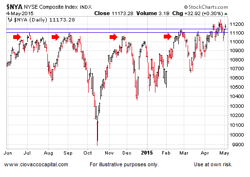
As shown in the chart below, the broad NYSE Composite Stock Index (NYA) recently broke above resistance that had been in play for ten months (see red arrows). Is the bigger picture currently favoring a failed stock market breakout or resumption of the current bullish trend in stocks?
Longer-Term View Holding Breakout
When markets are saying the same thing via multiple time frames, it increases technical confidence. The NYSE Composite also recently broke above levels dating back to October 2007. The green arrows below show successful retests of recent bullish breakouts. Regardless of what happens in the intermediate-term, as long as the NYSE Composite can hold above 10301, we still have a successful and bullish long-term breakout for stocks. A move below 10301 would increase concerns. Monday’s close was 11173.

Is Fear Gaining Traction?
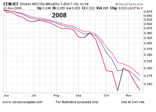
The chart below shows the performance of Emerging Market stocks (EEM) relative to defensive-oriented Treasury bonds (IEF) during the “max fear” phase of the 2008 financial crisis. The downward slope of the EEM:IEF ratio is what fear looks like.
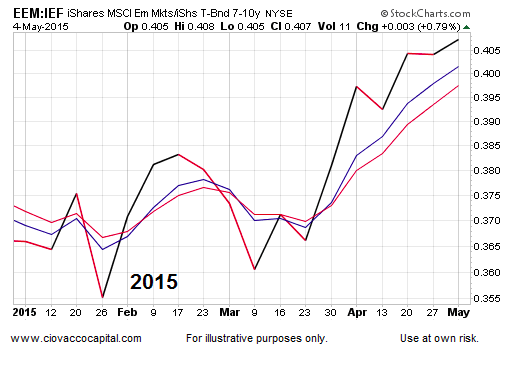
How does the same chart look today? Answer: much better. The conviction to own emerging market stocks has been higher than the conviction to own defensive bonds in recent months, which looks more like confidence than fear.
Is Systemic Fear Increasing?
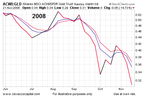
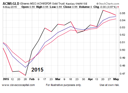
When investors were concerned about the stability of the global financial system in 2008, global stocks (ACWI) significantly underperformed Gold (GLD). The chart below has a fearful look.
Rather than lagging Gold, global stocks have been significantly outperforming gold in 2015. The chart below is not raising yellow flags.
Is The Economy On The Ropes?
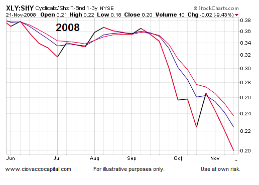
If we felt the U.S. consumer and economy were in big trouble, we rationally could surmise that (a) the economy was not on the verge of major improvement, and (b) the Fed was not on the cusp of raising interest rates. Under those less-than-perfect circumstances, we might expect to see a chart like the one below, which shows consumer stocks (via the popular ETF – XLY) significantly underperforming 1-3 year Treasury bonds.
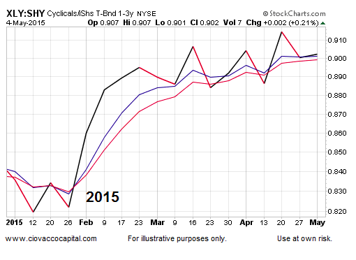
The exact same chart looks much better in May 2015 (see below). The XLY:SHY ratio remains in a bullish uptrend on a weekly chart.
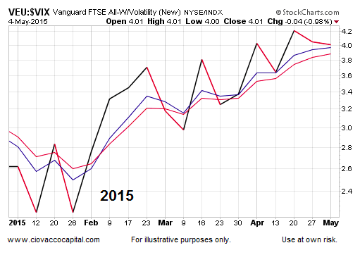
Economic Confidence vs. Volatility Fear
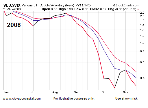
If you believe foreign economies are on solid footing, foreign stocks (via VEU) might be appealing to you. If you felt stock market volatility and uncertainty were just around the corner, you might prefer to own the Volatility Index (VIX) – otherwise known as the “fear index”. The 2008 version of the VEU:$VIX ratio has a fearful and pessimistic look.
The same ratio has been making a series of higher highs and higher lows in 2015 and looks quite a bit different than the 2008 chart.
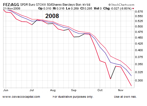
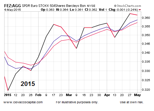
Will Greece Spoil The Fun?
As you might guess, European stocks (via FEZ) got hammered relative to a basket of diversified bonds (via AGG) during the financial crisis, allowing us to get a good handle on what “max fear” looks like.
The 2015 version of FEZ:AGG has a confident, rather than fearful, look. The weekly chart recently made a new closing high in favor of European stocks.
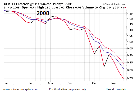
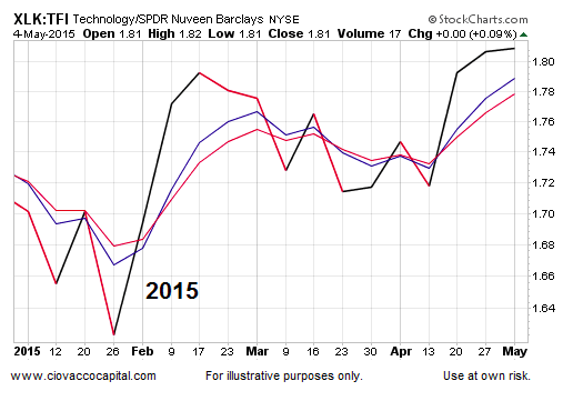
Technology vs. Municipals
If you owned tax-free bonds (TFI) in 2008, you slept quite a bit better than someone loaded up with technology stocks (XLK).
The same chart looks quite a bit more promising for tech aficionados in 2015. The XLK:TFI ratio recently printed a new weekly closing high, indicating a healthy market for tech stocks.
Investment Implications – The Weight Of The Evidence
Could the recent trading range in U.S. stocks break in a bearish manner? Yes, any outcome is possible in the financial markets. However, the weight of the evidence tells us the odds continue to favor bullish outcomes over bearish outcomes. The previous sentence is based on the data we have in hand. If the evidence changes, then the probabilities will change as well, which speaks to the need for unbiased observation and maximum flexibility. If you want to dig a litter deeper, this week’s stock market video expands on the concepts presented above.
Follow CCM on Twitter: @CiovaccoCapital.
Author holds positions in securities mentioned for himself and clients at the time of publication. Any opinions expressed herein are solely those of the author, and do not in any way represent the views or opinions of any other person or entity.


 Ready To Break Out?")


