 Before we begin to examine the recent bottom and subsequent stock market turn higher, investors were greeted with an eye-popping nugget of economic data Tuesday morning. From Reuters:
The Commerce Department said on Tuesday durable goods orders, items ranging from toasters to aircraft that are meant to last three years or more, jumped 22.6 percent last month after an upwardly revised 2.7 percent increase in June. July’s increase was the largest on record and far outpaced economists’ forecasts for a 7.5 percent advance.
While the record spike in durable goods was heavily impacted by aircraft orders and there were some concerning items in the report, a 22.6% gain is a 22.6% gain. The never seen before print on the economy falls into the good news/bad news category. The good news is the economy appears to be moving away from a tepid state. The bad news is today’s report will spark chatter about the Fed possibly pulling their first rate hike forward.
Risk Is About Probabilities
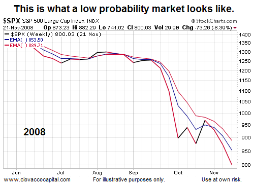
A reasonable standard for “how much to invest” is based on the probability of producing successful outcomes. Charts can help us monitor and assess investment probabilities. For example, the weekly chart of the SPDR S&P 500 ETF (SPY) below shows a period with a very poor risk-reward profile.
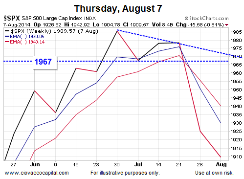
August 7: Not A Good Look
The chart below shows the S&P 500 as of Thursday, August 7. The August 7 profile has similarities to the 2008 profile above, which told us the probability of bad things happening was higher on August 7 than it was on July 1.
Probabilities Account For All Outcomes
When we say “the probability of bad things happening has increased”, it does not imply the probability of good things happening is zero. Therefore, we use charts not as a forecasting tool, but rather a tool to monitor the probability of investment success. The same concepts are used to manage risk and reward in countless businesses. From Encyclopedia Britannica:
Actuarial statements about the life expectancy for persons of a certain age describe the collective experience of a large number of individuals but do not purport to say what will happen to any particular person. Similarly, predictions about the chance of a genetic disease occurring in a child of parents having a known genetic makeup are statements about relative frequencies of occurrence in a large number of cases but are not predictions about a given individual.
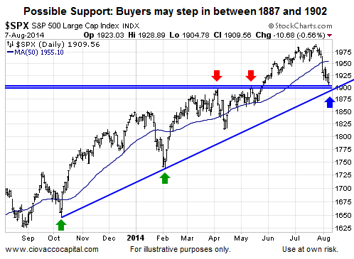
Support Called For Patience
Using a probabilistic approach, after the close on August 7, we noted some patience was in order to see what happened at a nearby area of possible support. The chart below is dated August 7.
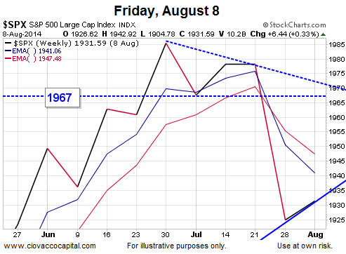
Stocks did hold support and rallied 22 points on Friday, August 8. The big rally enabled the S&P 500 to post a gain of 6 points for the week. And set the stage for the ensuing stock market turn higher.
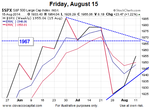
Weekly Gains Provided A Reference Point
Stocks were green again the following week. The rally allowed us to add the lower blue trendline in the August 15 chart below, which set guideposts on the high end near 1968 (dotted-blue line) and on the low end near 1940 (solid blue line). Commentary on the chart from August 15 can be found in this video clip.
Morphing Into A More Favorable Look
After a 16 point gain on Monday, August 18, the weekly chart of the S&P 500 was looking less and less like the scary 2008 chart shown earlier. And the stock market turn higher was gaining some steam.
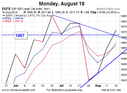
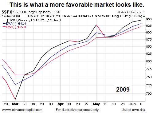
In fact, if we compare the August 18 chart above to a more favorable period for investors in 2009, we can see some similarities, which spoke to improving odds of investment success.
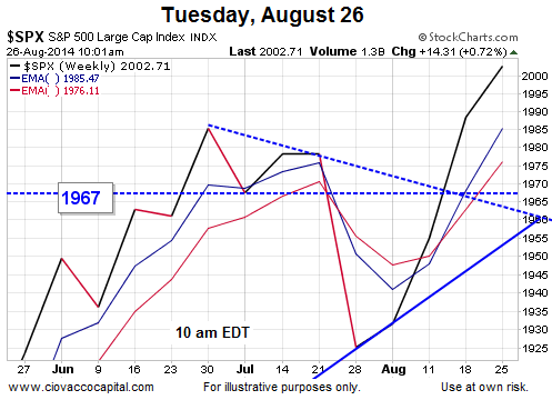
Looking at the chart below as of Tuesday, August 26, another bullish hurdle was crossed when the index broke above 1967.
Investment Implications – The Weight Of The Evidence
Does the present day chart mean downside risks have left the building? No, the present day chart has been telling us the probabilities of success have been improving. Consequently, our market model has reduced cash and incrementally added to our stock positions (VTI) several times since the August 7 intraday low.
CCM Market Model – we added to growth side, as planned, based on improvement in risk-reward profile. Tomorrow is a new day.
— Chris Ciovacco (@CiovaccoCapital) August 18, 2014
Our approach from here will be the same; monitor the charts/probabilities and make adjustments as needed. Would a monitor and adjust approach have helped in 2008? You can decide after watching this video.
“Because things are the way they are, things will not stay the way they are.” – Bertolt Brecht
Read more from Ciovacco Capital here.
Follow CCM on Twitter: @CiovaccoCapital.
Any opinions expressed herein are solely those of the author, and do not in any way represent the views or opinions of any other person or entity.
")


