With all the hand-wringing over whether or not the August lows will hold, this is the least of the bulls’ stock market concerns. Bigger challenges probably lie ahead.
Of the big four – the S&P 500 Index, the Dow Industrials, the Nasdaq Composite, and the Russell 2000 Index – it is the latter that has so far undercut the August 24th low, although ever so slightly. Regardless if the other three undercut those lows before stabilizing or find their footing right here, it is probably a moot issue. A bounce/rally is overdue and should be coming near-term.
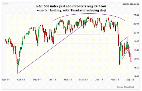
3rd quarter earnings season begins soon, and the bar is low. At $28.66, sell-side operating earnings estimates are $2.36 lower than in February, as well as versus $29.60 last year. Stocks have been under pressure since they reversed intra-day post-FOMC decision on the 17th. On a daily basis, conditions are beginning to get oversold. Tuesday produced a daily doji on the S&P 500 (Chart 1 below). The odds of a bounce/rally are decent. Whether this sustains into strength medium-term remains to be seen – an uncertainty that pales in comparison to what could be brewing.
Let’s review seven charts that highlight some technical and fundamental stock market concerns.
The vicious selling in August has wrought technical damage to the afore-mentioned indices, plus others. In more ways than one, this was months in the making, although it felt like it came out of nowhere. The S&P 500, for instance, suffered a monthly MACD bearish crossover as early as April – a rare occurrence in and of itself. The index peaked at 2135 in May. The last two bear markets were preceded by MACD crossovers as well – in December 2007 and February 2000. So yes, this should be on bulls’ long-term list of stock market concerns.
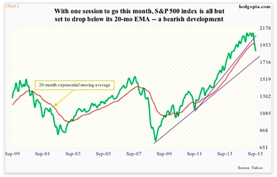
As should Chart 2 (see below). There is one more session to go this month, and the S&P 500 is on the verge of dropping below its 20-month exponential moving average. As is the case with the afore-mentioned MACD crossover, this does not happen often. The last time this occurred was in August and September of 2011. And as is the case with monthly MACD crossover, this also preceded the last two bear markets.
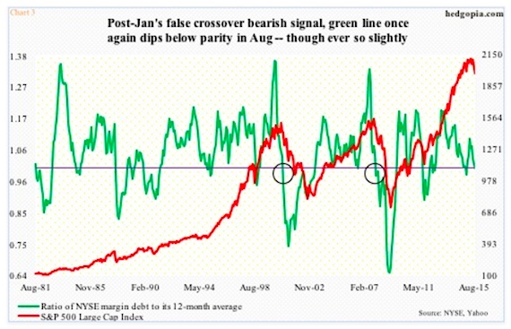
Then we have Chart 3 regarding Margin Debt, which is as of August. Hence the red line does not capture the month-to-date 4.5-percent drop in the S&P 500. More important is what the green line is saying. It is the ratio of NYSE margin debt to its 12-month average. Margin debt peaked at $507.2 billion in April. August was $473.4 billion. Not surprisingly, sustained deceleration is not stock-friendly. That is what the green line seeks to capture. Once it sustains below one, margin debt no longer becomes a tailwind, which is what we saw in late 2000 and 2007 (circles in the chart). In August, the ratio dropped below one, although barely. With stocks under pressure again in September, it is probable the ratio continues lower this month – another of those developments that should be on bulls’ long-term worry list.
Historically, once any of these signals is triggered, over time stocks tend to come under sustained pressure. Will they come true this time? Mindful of the fact that central-bank activism is alive and well, a fitting question would be ‘what if?’. What if they come true? Any bull market that has gone on for six-plus years can be expected to have excesses built in. This one does too. Unwinding of ‘too much of a good thing’ can be painful. Below are more examples of such excesses.
continue reading on the next page…

")


 Rolling Over At Key Fibonacci Level?")
