2016 At The Half: Contrasts and Consistency
An in-depth look at our 2016 Mid-Year Strategy Outlook. Stocks, Bonds, monetary policy, and more…
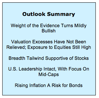
Highlights:
- Federal Reserve Continues to Struggle with Messaging
- Prospects for Economy May Be Better Than Assumed
- Despite Rally, Equity Funds Continue to See Outflows
- Market Breadth Offering More Support This Year Than Last
2016 has been a study in both contrasts and consistency. Contrasts can be seen in the performance of the stock market over the course of the first half and into our mid-year investment strategy outlook. Near the mid-way point of the first quarter, the S&P 500 Index had posted a year-to-date decline of more than 10%. By the end of the quarter, however, the S&P 500 Index was back in positive territory for the year. Since then the S&P 500 Index has oscillated within a narrow 75 point range, echoing the price action that was seen over the course of the first half of 2015.
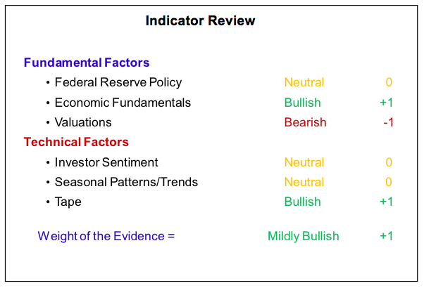
The consistencies and contrasts extend beyond the movement of popular stock market averages. While the fundamental situation is little changed, technical conditions now are quite different from 2015. The Federal Reserve continues to offer mixed signals and struggle with communication while its actual policies have not become a headwind. The economy, while poised for growth continues to struggle to build momentum and valuations remain stretched, with corporate fundamentals not matching price performance.
Investors continue to have elevated exposure to equities but optimism has been slow to build even as stocks have rallied off of their lows. From a seasonal perspective, clarity around the outcome of this fall’s elections could be a tailwind for stocks, provided off course, that we do not get any more NOISE (News-driven One-time Important Strategic Events). While NOISE tends to be just noise, getting through it can add to volatility. The marked improvement in the broad market is a significant difference between 2015 and 2016 and could be a source of support if noise levels do become elevated.
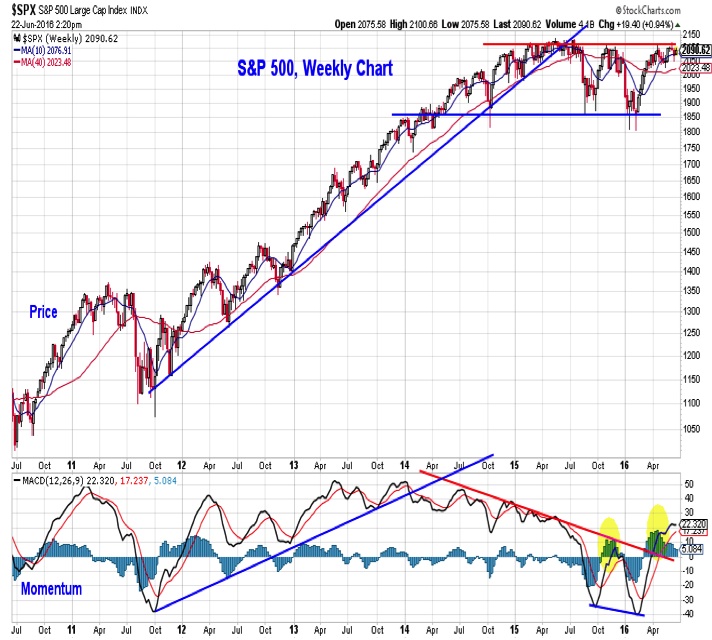
S&P 500 Index
The weekly chart of the S&P 500 provides a nice visual representation of the contrast and consistency that we are discussing. For all the noise that can be seen on a day-to-day basis, the S&P 500 continues to move within a well-defined trading range (as seen in the top portion of the chart to the right) that is nearly two years old. From a momentum perspective (seen at the bottom of the chart), 2016 could hardly be more different that 2015. While it is too early to conclude that a new momentum up trend has emerged in 2016, it does look like the downtrend that was in place last year has been broken. In other words, the consistency suggested by the continuation of the trading range environment may gloss over improvements that are being seen beneath the surface.
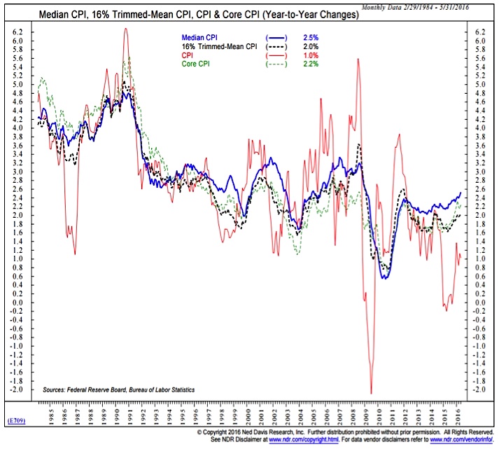
Federal Reserve Policy remains neutral. Actual monetary policy has not become a headwind for stocks. After the 25 basis point rate hike in December, the Fed has been on hold and the median projection among FOMC members is that only 50 basis points of tightening will be seen in 2016 (down from an early year expectation of 100 basis points of tightening). The Fed has been able to take a wait-and-see approach to rate hikes because inflation remains relatively benign. But when one looks across several inflation indexes (the chart here shows different takes on the CPI), it appears that inflation has started to move off its lows. The yearly change in the median CPI, for example, is now above 2.5%, the highest level since 2008.
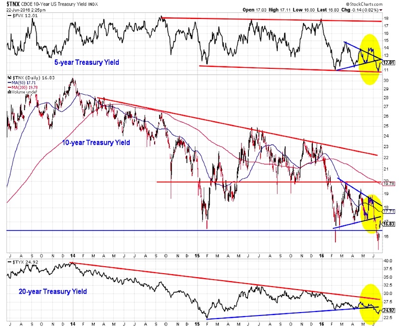
Despite this up-tick in inflation, fixed income investors have pushed bond yields lower in 2016, with the most recent drop in yields coming as macro-related uncertainties have intensified in June. Low yields around the world have helped keep demand for U.S. Treasuries relatively robust. But the gyrations seen in the yield on the 10-year T-Note this year reflect our view on why Fed policy is currently neutral. While the Fed has not yet raised rates in 2016, it has, through various media, hinted that it would at upcoming meetings. These hints have helped produce spikes in bond yields, which have then reversed once it became clear that the Fed was not yet ready to act.
The issue for the Fed is that its intention to be transparent and open has the effect of providing more noise and uncertainty for stocks and bonds. At this point, less might be more when it comes to Fed communications. This might mean fewer Fed officials giving speeches and doing away with (or reducing the frequency off) the now quarterly Summary Economic Projections released in conjunction with FOMC meetings. While it might seem useful to know what members of the Fed are forecasting for growth, inflation and the path of interest rates, this should be tempered by the realization that forecasts are rarely correct. On the positive side, the recent lowering of the long-rung expected growth for the economy could provide a lower threshold for the economy to get over.
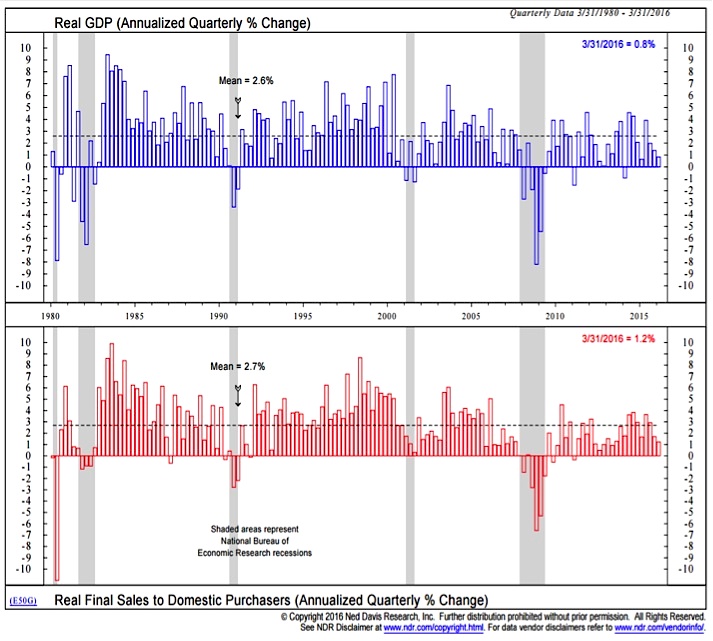
Economic Fundamentals are still bullish. Growth has been weaker than expected to start 2016, but that has been a recurring theme over the course of the last few years. Domestic demand (the bottom clip in the chart to the right) has been a bit more robust that overall GDP growth, but after posting better than average growth in five of six quarter, growth in domestic demand has slipped over the past six months. The good news from a growth perspective is that real-time tracking of second quarter activity suggests growth has rebounded and the numbers for the first half overall will not be out of line with what has been seen in recent years.
A hotly debated economic topic in the first half of 2016 has been the decline in productivity growth. While it has come into focus this year, the trend has really been deteriorating since 2000. That was about the same time that actual growth started to fall short of economist expectations. Growth began exceeding expectations in the early 1980s, which according to this chart was the same time that the trend in productivity growth began to improve. Weakness in productivity growth may just be part of a secular trend for the economy – and if long-term conditions in the economy are improving, productivity growth (and economic growth overall) could soon surprise on the upside.
One of the reasons suggested for weak productivity growth is the relative lack of investment that has been taking place in the economy. While investment shrank to nearly zero after each of the past two recessions, more recently it has rebounded and is at a historically high level relative to GDP. Looking again at 1980 as an example, the cumulative effect of investment spending took time to manifest itself in productivity growth and economic growth. It is not clear that the same will not hold this time around. That this is not being widely forecast does not, in our mind, make it less likely to happen. In fact, with businesses now facing rising labor costs and having trouble hiring skilled workers, investment spending could accelerate in coming quarters.
![]()
There are numerous ways to discuss the health of the labor market. Unfortunately, the headline generating monthly payroll data might be one of the least useful. The last two data points in that survey have been disappointing and this has helped fuel speculation that the recovery in the labor market is running out of steam (this appears to have played a part in the Fed’s decision not to raise rates in June).
continue reading on the next page…


